Understanding the Basics of Color Theory in Minimalist Interiors
Chosen theme: Understanding the Basics of Color Theory in Minimalist Interiors. Welcome to a calm yet expressive journey through hue, value, and contrast—applied with intention so your minimalist spaces feel serene, personal, and vividly alive without clutter. Comment with your favorite minimalist accent color to begin.
Hue is the family of color, value is how light or dark it is, and chroma is intensity. In minimalist rooms, dialing back chroma while carefully shifting value often yields depth without visual noise. Share which dimension challenges you most.
Why Color Theory Matters in Minimalism
Neutrals carry subtle temperature and mood. A warm greige can feel welcoming, while a cool dove gray reads crisp and architectural. Minimalism gains soul when neutrals are thoughtfully layered, not defaulted. Which neutral speaks your language of calm?
Why Color Theory Matters in Minimalism
Building a Minimalist Palette: Neutrals, Accents, and Space
Test two to three allied neutrals: an off-white for light, a soft gray or greige for structure, and a deeper anchor like charcoal or cocoa. Keep undertones aligned. Tell us which trio you are considering for your home.
Building a Minimalist Palette: Neutrals, Accents, and Space
Select one accent with low to medium chroma—olive, muted clay, or ink blue. Use sparingly across textiles, art, or one painted plane. Consider a 10 percent accent rule. What accent color would make your heart slow down, not race?

Daylight Direction Changes Everything
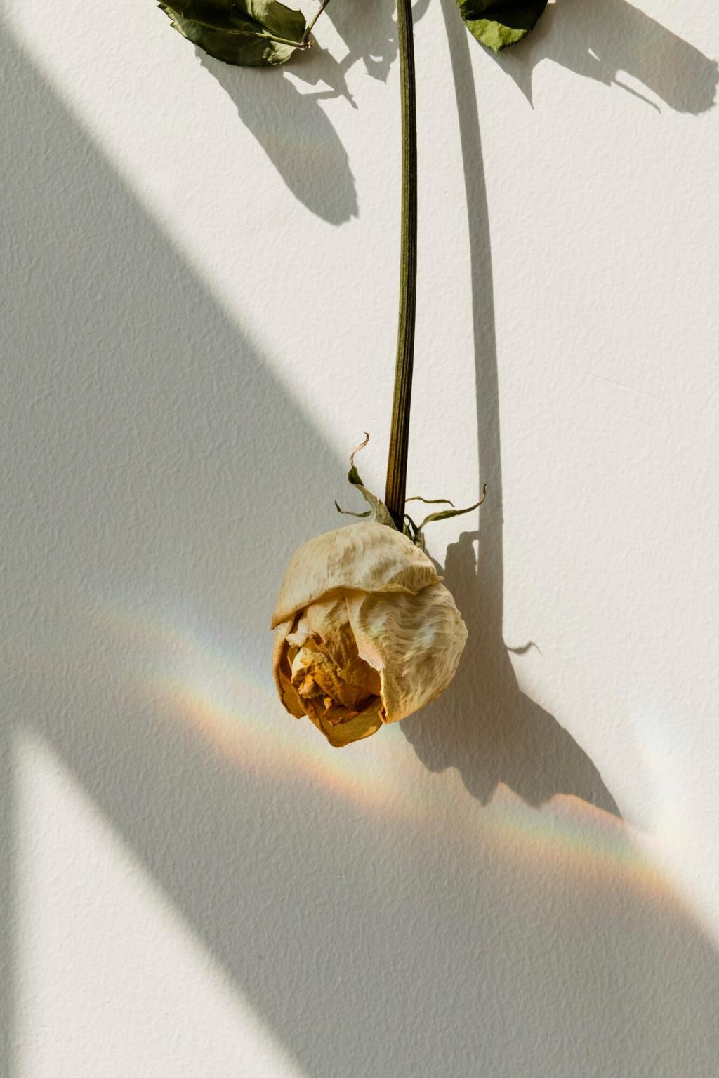
North light cools and flattens colors, favoring warmer neutrals; south light warms and intensifies, making cool hues feel balanced. East and west light swing mood across the day. Drop a comment with your room’s light direction for tailored tips.
Finish and Texture Shape Perception
Matte paint absorbs light, increasing softness; eggshell adds subtle glow; satin and gloss reflect strongly, amplifying value contrast. Natural textures—linen, limewash, oak—scatter light softly. Which finish best suits your minimalist goals: cozy cocoon or crisp clarity?
Undertone Detective: A Simple Method
Place swatches beside true white and a pure gray. Warm undertones reveal peach, yellow, or red shifts; cool lean blue, green, or violet. Compare against your floors and furnishings. Share a photo of your swatches to crowdsource undertone confirmations.
Soft Contrast for Serenity
Pair off-white walls with light oak and fog-gray textiles. The values are close, so the room breathes. Add a single deeper note—charcoal vase or ink throw—to ground. What soft-contrast pairings help you relax after a long day?
Monochrome, Made Lively
Stay within one hue family and vary value and texture: chalky plaster, wool boucle, and smoked glass in grays. The eye reads depth without ornament. Post your favorite monochrome texture mix for minimalist coziness.
Ratios That Keep Rhythm
Try 70 percent light neutral, 20 percent mid-tone support, 10 percent accent. This ratio maintains clarity while adding punctuation. Adjust per room size and light. Which room in your home needs a ratio reset this season?
Testing and Iteration: Swatches, Boards, and Real Life
Large Swatches, Not Tiny Chips
Paint poster boards at least letter-size and move them around. Observe next to floors, rugs, and cabinets. Photograph morning, noon, and evening. Share your three finalists and we will vote together on the most balanced choice.
A 24-Hour Light Journal
Note how colors read each hour. Does the off-white yellow at sunset? Does gray go purple at night under LEDs? Adjust undertones accordingly. Try this for one week and report your biggest surprise in the comments.
Edit Objects to Fit the Palette
Minimalist color thrives when decor aligns. Remove clashing items, then reintroduce selectively. Slipcovers, new lampshades, or re-oiled wood can harmonize without buying new. What single change could bring your room into tune tomorrow?
Case Stories: Minimalist Homes Transformed by Color
A 320-square-foot studio shifted from stark white to sand white walls, fog-gray curtains, and one charcoal linen headboard. The owner reported deeper sleep and less visual stress. Which detail from this story could help your own tight space?
Case Stories: Minimalist Homes Transformed by Color
Replacing blue-tinted white with warm off-white, plus an olive throw and clay pottery, calmed evening glare and reduced toy chaos. Same furniture, new harmony. What small accent would bring warmth to your gathering space tonight?
